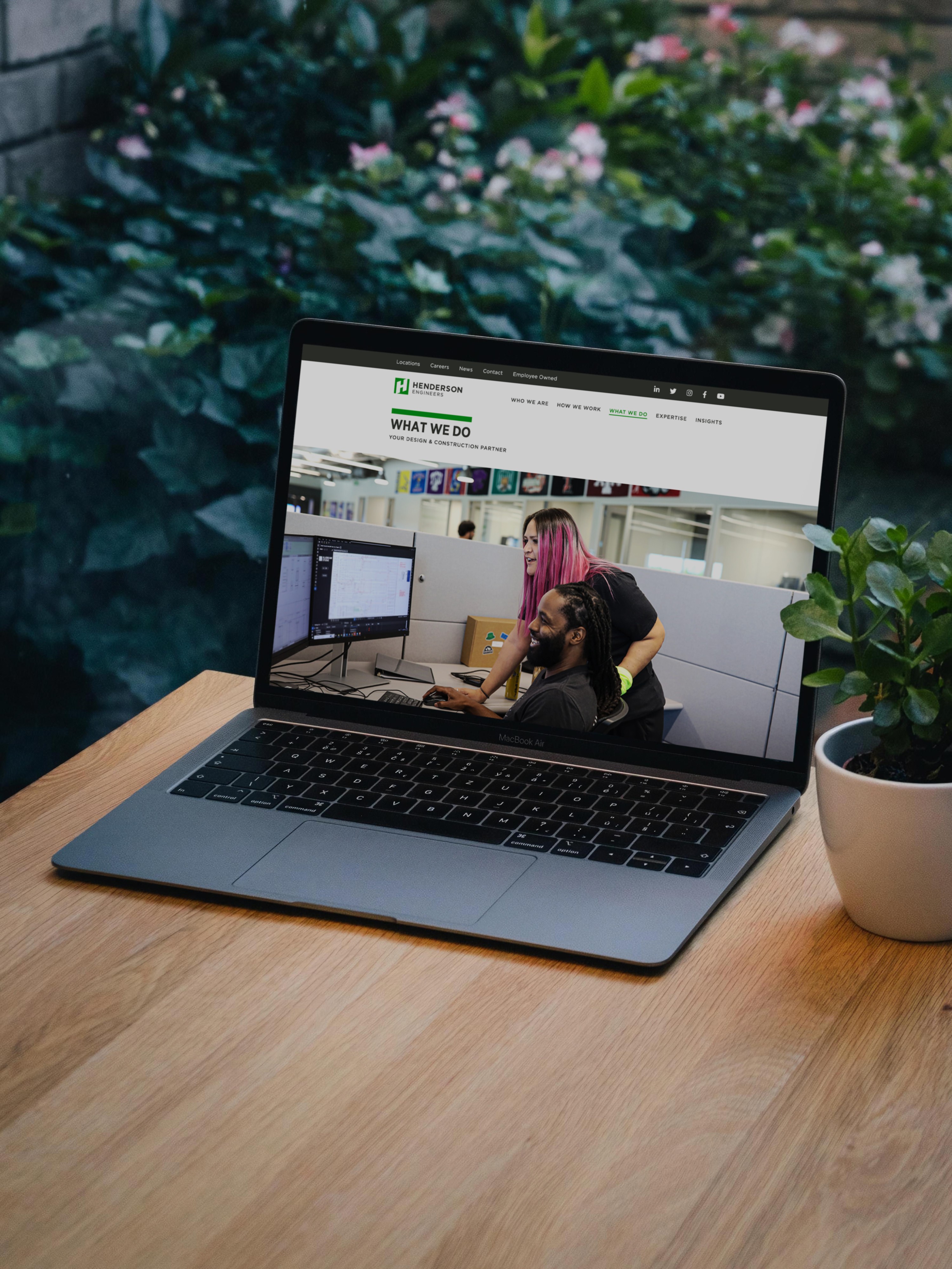
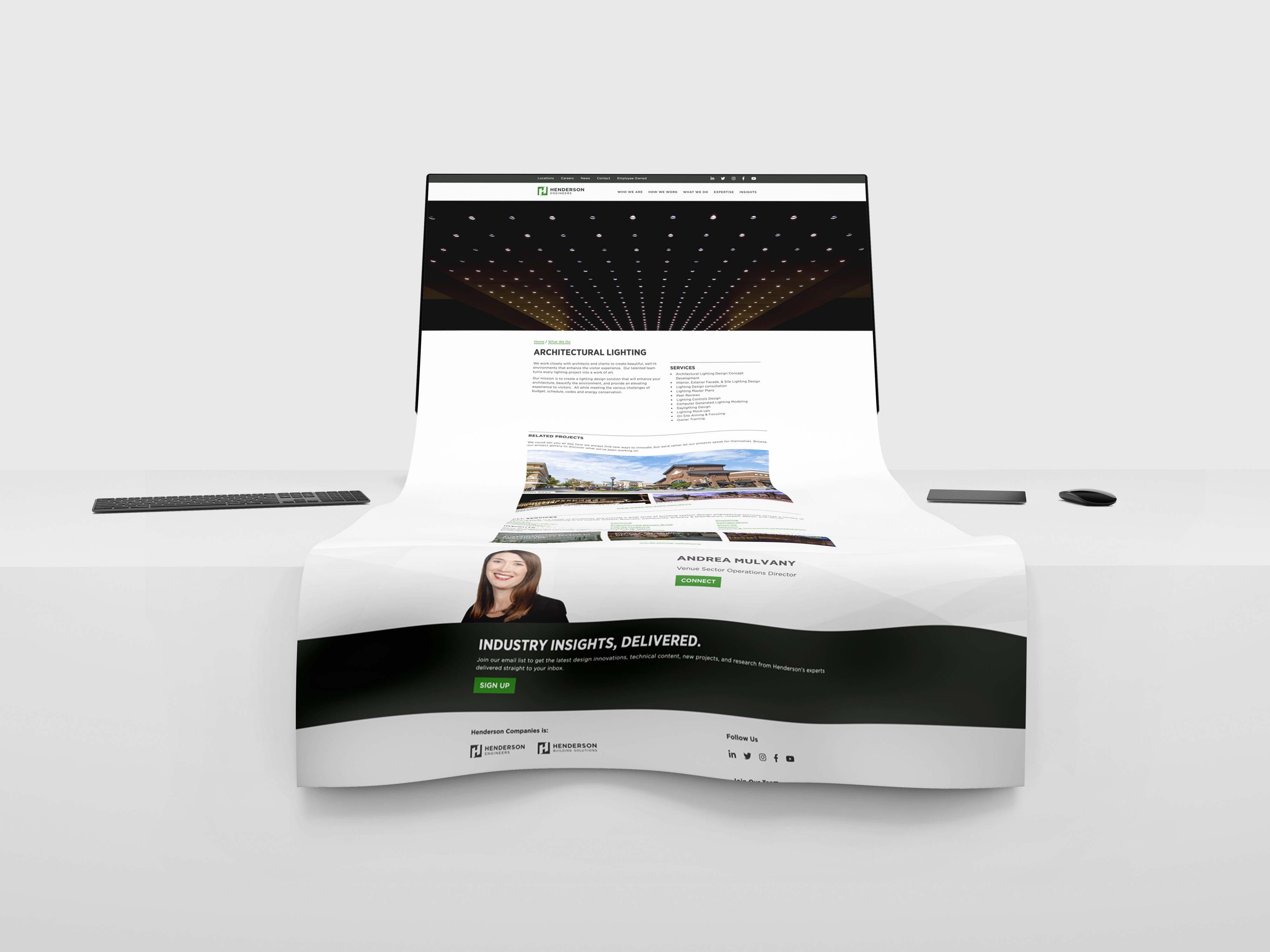
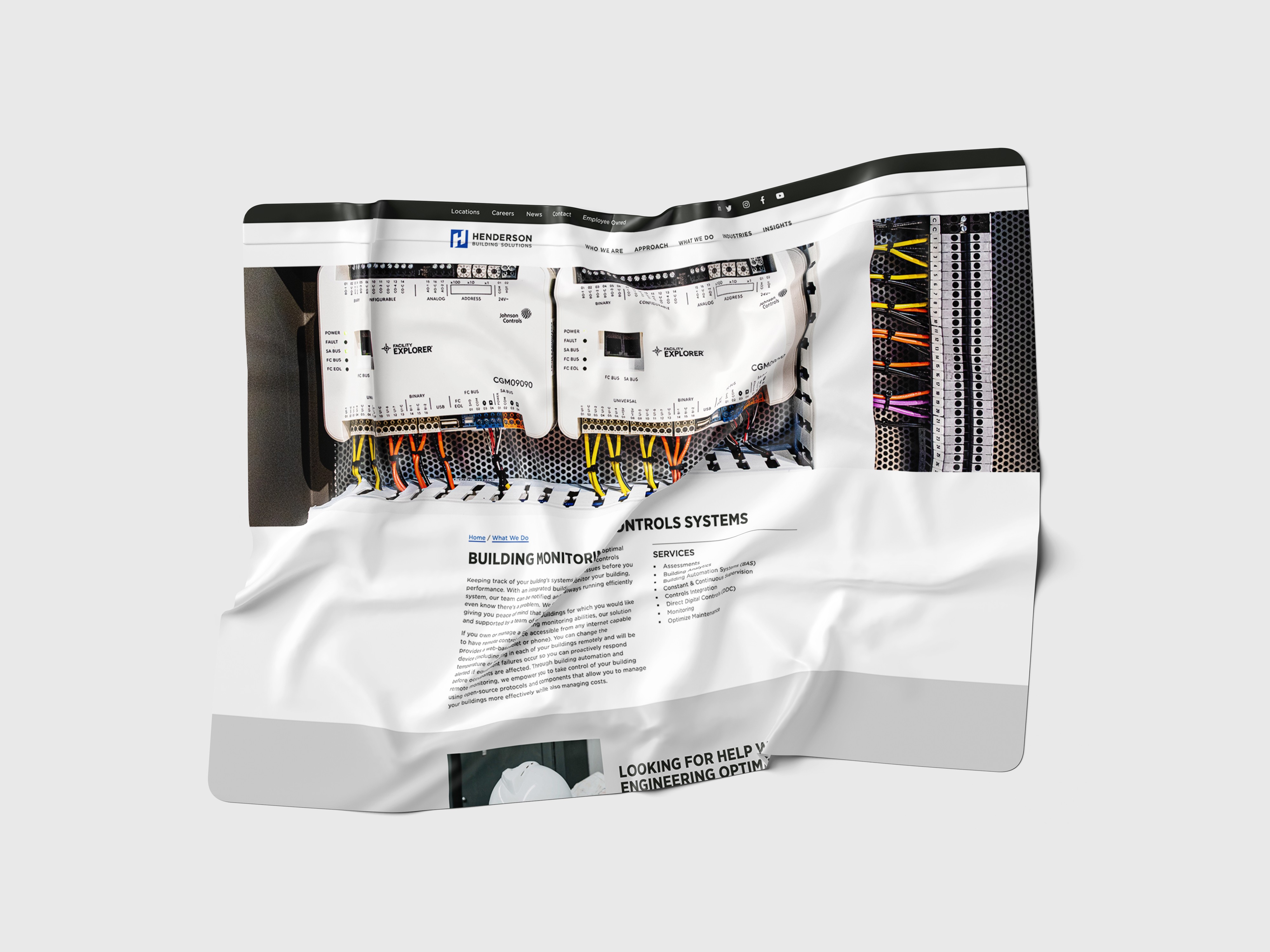
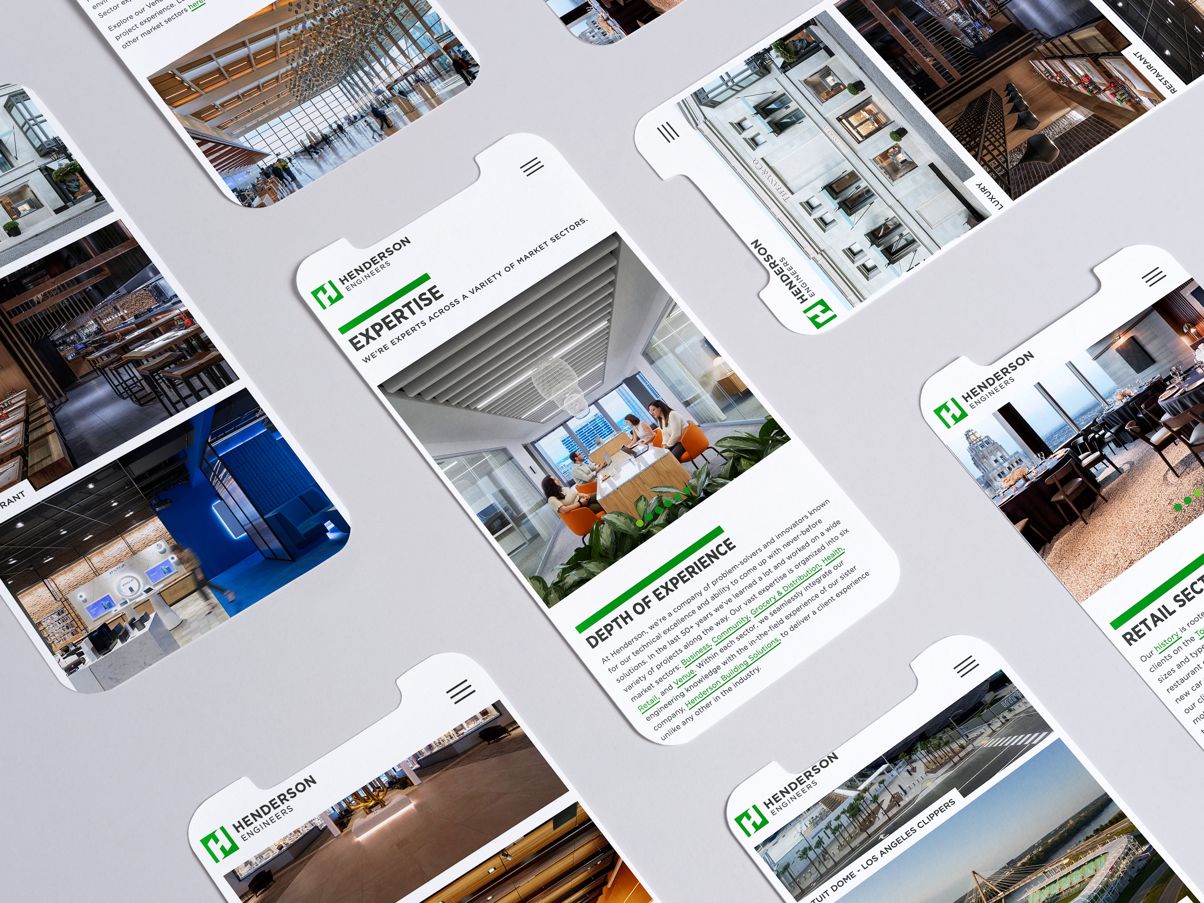
What We Do
The What We Do section was conceived to articulate the seamless integration between Henderson Building Solutions and Henderson Engineers. Recognizing the need for clients to understand how our construction, engineering, and design services interconnect, we developed this section to showcase our unified approach. By highlighting our collaborative efforts, we aimed to provide a clear narrative of our comprehensive services, reinforcing our commitment to delivering cohesive solutions throughout the building lifecycle.
Role:
UX + UI Designer
Industry:
AEC
Duration:
16 weeks
Challenges
Clarify Service Integration: Demonstrate how Henderson Building Solutions and Henderson Engineers collaborate to offer end-to-end solutions.
Improve User Understanding: Make it easy for clients to see how our services connect—from design through delivery—without feeling siloed across two websites.
Content Strategy: Ensure copy, visuals, and CTAs clearly guide users to deeper information on either site, depending on their needs.
Scalable Design: Build a flexible layout that can evolve as our services grow or shift, without needing a complete overhaul.
My Approach
Discovery Phase
Stakeholder Interviews: Collaborated with leaders from both Henderson Engineers and Henderson Building to define messaging goals and content priorities.
Content Mapping: Audited both websites to identify where overlap or confusion existed and how we could better guide users between them.
User Flow Exploration: Reviewed analytics and heatmaps to understand where users were dropping off and what they were looking for.
Design & Development
Information Architecture: Structured content to reflect the synergy between our engineering and construction services.
Visual Design: Developed a cohesive visual language that aligns with our brand identity, using consistent typography, color schemes, and imagery.
Responsive Layout: Ensured the section is accessible and functional across all devices, enhancing user engagement.
Testing & Iteration
Team Review: Walked both internal teams through the prototype to gather input on clarity, content accuracy, and usability.
Content Refinement: Adjusted copy and CTA structure based on feedback to ensure users felt guided, not bounced between sites.
Accessibility & QA: Worked with dev and QA teams to ensure all elements met accessibility standards and functioned smoothly across devices.
Results
The new What We Do section successfully positioned Henderson’s dual-company structure as a strength—not a point of confusion. Early feedback from clients and internal teams highlighted how much easier it was to understand our full-service capabilities. The design and structure helped reduce user drop-off between the two sites and created a smoother, more intentional client journey. It also served as a central reference point for marketing and BD teams to explain how our companies work together.
Future Plans
Interactive Elements: Introduce interactive features, such as service filters or dynamic case studies, to enhance user engagement.
Client Testimonials: Incorporate client feedback to provide real-world insights into our collaborative success stories.
Conclusion
The What We Do section was a strategic effort to turn complexity into clarity. By creating a seamless experience across two brands, we gave users a better understanding of who we are, how we work, and why it matters. This project emphasized the importance of smart content structure, collaborative storytelling, and a user-first mindset—turning a potential point of friction into a valuable client touchpoint.