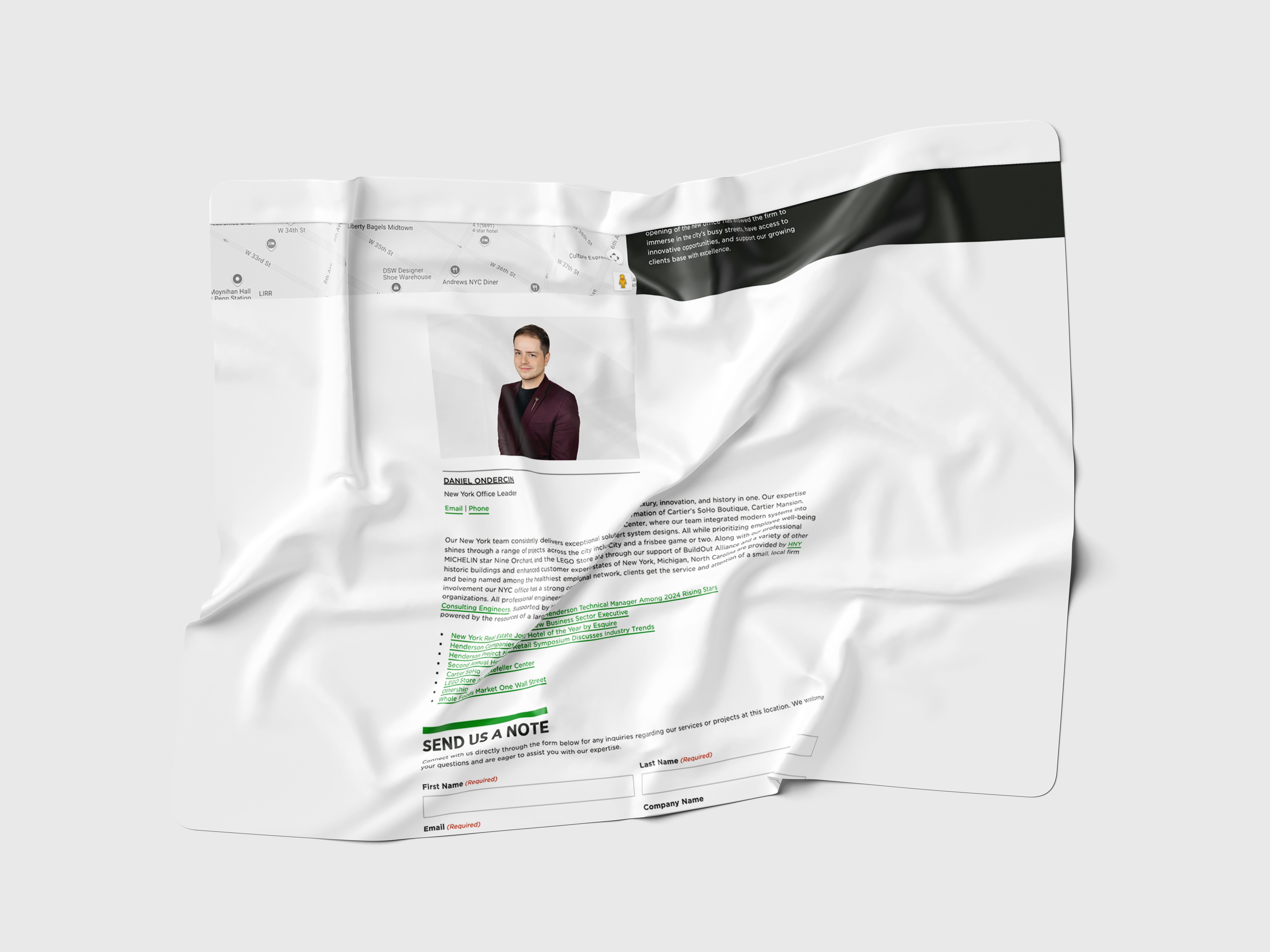
Locations Section
In an effort to create a more client-centric experience, I led the redesign of our Locations section—a critical touchpoint for clients trying to understand where we operate and how to connect with our teams. The previous experience was static, outdated, and difficult to navigate. I set out to make something far more dynamic and user-friendly.
Role:
UX + UI Designer
Industry:
AEC
Duration:
24 weeks
Challenges
Modernize & Improve Usability: Redesign the outdated Locations section to be more interactive, navigable, and visually consistent with the rest of the site.
Client-Centric Design: Make it easier for clients to connect with the right teams by surfacing key details like office contacts, regional leadership, and market specialties.
Scalability: Ensure the layout and CMS integration can accommodate new offices and updates without heavy redesign.
Mobile & Accessibility: Build with best practices in accessibility and responsive design to create a seamless experience across all devices.
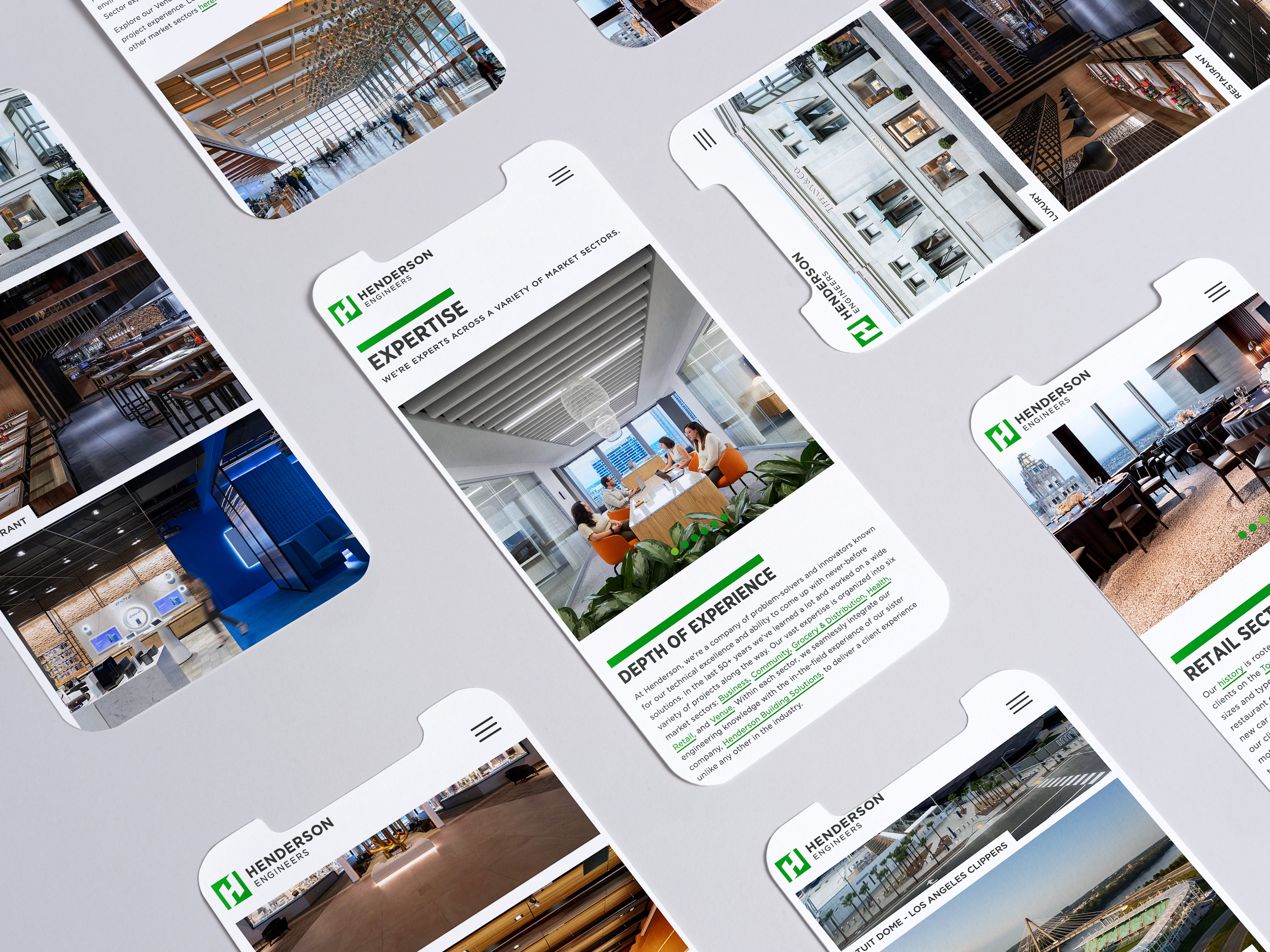
My Approach
Discovery Phase
Content Audit: Reviewed the existing Locations pages to identify pain points, gaps, and opportunities for new content types.
Competitor Research: Explored how other AEC firms and client-facing organizations handle location-based UX and filtered that through the lens of our brand.
User Behavior Review: Analyzed traffic patterns and user flows to understand how clients currently navigate location information—and where they hit roadblocks.
Design & Development
Wireframing & UI Design: Sketched and refined a modular layout that emphasized clarity, consistency, and adaptability across markets.
Mapping & Interactivity: Integrated a dynamic map experience with the ability to switch between list and region views for a more personalized experience.
CMS Integration: Collaborated with developers to connect location content to our CRM, automating updates and simplifying future edits.
Testing & Iteration
Stakeholder Review: Presented interactive prototypes to internal stakeholders including client directors and office leadership to gather feedback.
User Testing: Conducted informal usability testing with clients and internal users to validate navigation, content hierarchy, and overall experience.
Refinement & Finalization: Iterated on the final design based on feedback, tightening up visual consistency and improving microinteractions to enhance the user journey.
Results
The updated Locations section launched smoothly and immediately delivered value—clients could now navigate to the right contact with fewer clicks, while internal teams found it easier to keep information up to date. Post-launch feedback called out the clarity of the design, the utility of the interactive map, and the professionalism of the overall experience. The new section has become a central part of how we connect with clients across the country, and it supports our reputation as a responsive, people-first firm.
Future Plans
Content Enhancements: Include more regional project highlights, team member spotlights, or community engagement stories.
Analytics Review: Track engagement with the section quarterly to refine layout and content placement.
Conclusion
This project was a perfect example of thoughtful design meeting real user needs. Over the course of several months, we worked closely with marketing, regional leadership, and our dev team to reimagine what the Locations section could be—not just a directory, but a tool for connection. By combining smart UX, dynamic content, and a scalable structure, we created an experience that better serves our clients while staying true to the brand. The new section doesn’t just tell people where we are—it shows them how to reach us, understand us, and work with us more easily than ever before.